Create Style
What are we styling?
All
roblox
youtube
google
discord
spotify
pinterest
yandex
facebook
whatsapp
vk
instagram
twitter
pokemonshowdown
tumblr
netflix
wikipedia
fandom
openai
reddit
amazon
baidu
Most popular Stackoverflow Themes, Skins & Backgrounds
Style Stackoverflow with custom Stackoverflow themes! Change the background, color, schemes, fonts, and more! Share your own themes for Stackoverflow too!
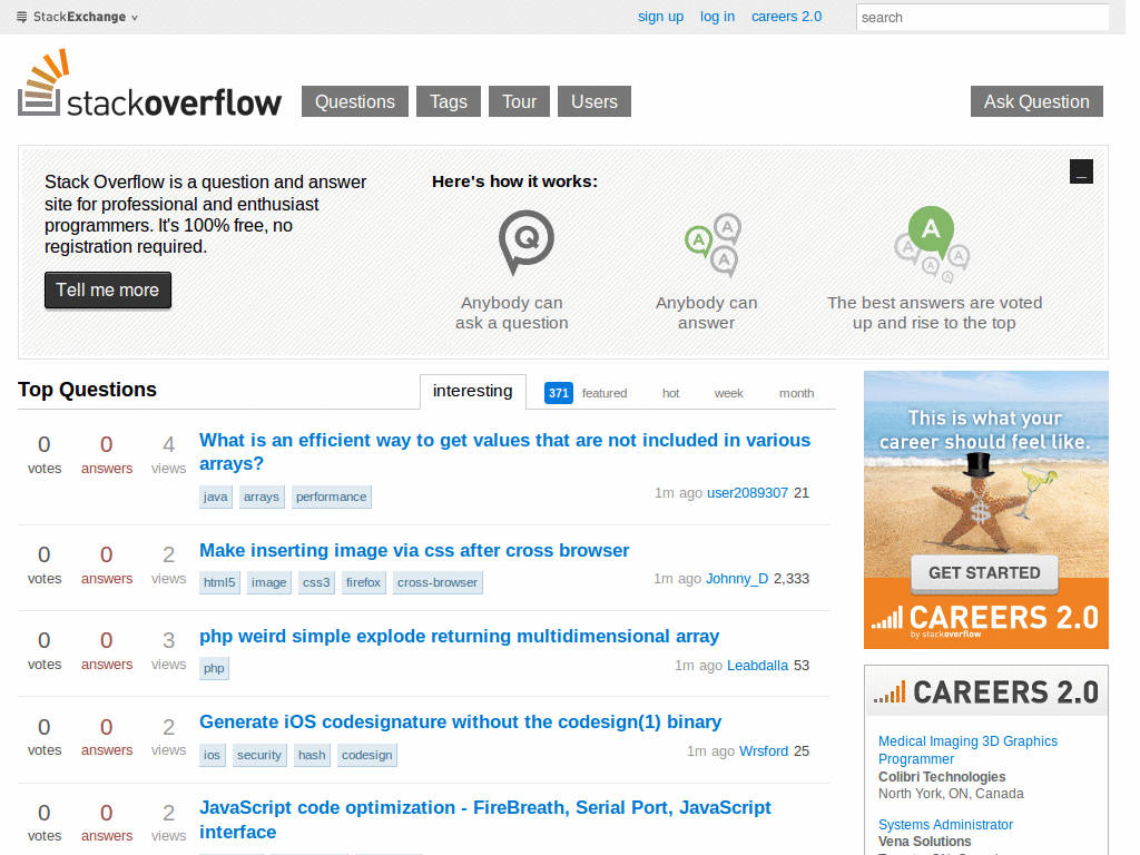
Stackoverflow
4
StackOverflow - Atom One Dark
9
Stackoverflow
3.8
MINE_JC99
0
Stackoverflow
3.6
StackOverflow Official dark theme Improved
1
Stackoverflow
3.6
Remove Silly Consent Banner - stackoverflow
0
Stackoverflow
stackoverflow.com - Small UI Improvements
0
Stackoverflow
Stackoverflow only with interesting questions
0
Stackoverflow
StackOverflow Fix Monotype on Linux
0
Stackoverflow
StackOverflow - Shrink Title
0
Stackoverflow
StackOverflow - Condense Right Modules
0
Stackoverflow
StackOverflow - Question Tweaks
0
Stackoverflow
Stack Overflow - Highlight comment on hover
0
Stackoverflow
Stack Overflow without reputation
0
Stackoverflow
stackoverflow - remove image from trademarked tags
0
Stackoverflow
StackOverflow - Useful Sidebar
0
Stackoverflow
Stackoverflow Curvy Shadows
0
Stackoverflow
Stackoverflow - remove images from tags
0
Stackoverflow
Stackoverflow Trilogy - Curves
0
Stackoverflow
Stackoverflow - Remove delete buttons from tags
0
Stackoverflow
Stack Overflow - One Hundred Paper Cuts
0
Stackoverflow
StackOverflow - B&W Interesting Question
0
Stackoverflow
BlackStack
0
Stackoverflow
StackExchange: Font
0
Stackoverflow
Stack Overflow - Christmas Theme
0
Enjoyin' Stylish?
Rate Us
thanks
rateStylish
What`s wrong?
Style not working
Too complicated
There`s a bug
Inappropriate content
Did not find what i was looking for
Submit Feedback