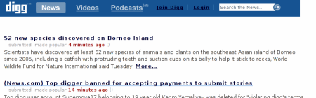
Most popular Themes, Skins & Backgrounds
Style with custom themes! Change the background, color, schemes, fonts, and more! Share your own themes too!


Top Rated Themes, Skins & Backgrounds


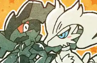
![ShowdownModules [Sun & Moon] | Pokémon Showdown](https://assets.userstyles.org/assets_packs/type=style/user_id=3015388/screenshot_fdec7c1e-995a-4893-9461-caa1fc9dd612_thumb.webp)


Newest Themes, Skins & Backgrounds


Youtube Styles Themes, Skins & Backgrounds


![Dark YouTube [Pink]](https://assets.userstyles.org/assets_packs/type=style/user_id=435915/screenshot_4dccb943-0844-4cd2-9d15-ab7be14e307b_thumb.webp)


Roblox Styles Themes, Skins & Backgrounds


Google Styles Themes, Skins & Backgrounds


Facebook Styles Themes, Skins & Backgrounds


![Red magic | Facebook [improved]](https://assets.userstyles.org/assets_packs/type=style/user_id=264265/screenshot_d71e0214-11c8-42d3-96d2-f160237edf3b_thumb.webp)


Enjoyin' Stylish?
Rate Us
thanks
rateStylish
What`s wrong?
Submit Feedback
Comments