Create Style
What are we styling?
All
roblox
youtube
google
discord
spotify
pinterest
whatsapp
facebook
instagram
yandex
vk
twitter
netflix
pokemonshowdown
tumblr
openai
wikipedia
fandom
reddit
baidu
amazon
Most popular Slashdot Themes, Skins & Backgrounds
Style Slashdot with custom Slashdot themes! Change the background, color, schemes, fonts, and more! Share your own themes for Slashdot too!
Slashdot
slashdot.org DK
0
Slashdot
Slashdot Cleanup - 2018
0
Slashdot
Slashdot Comment Scrollbars
0
Slashdot
Slashdotted
0
Slashdot
Slashdot - Remove/hide sidebar
3
Slashdot
Slashdot Flat Funky
0
Slashdot
Slashdot - Hide Ads
0
Slashdot
Cleandot - Cleaner Slashdot 0.02
0
Slashdot
slashdot - black minimal
0
Slashdot
Slashdot white minimal
0
Slashdot
slashdot.org - Solarized Dark
0
Slashdot
fix slashdot.org black
0
Slashdot
2016-09 Slashdot Max Width
0
Slashdot
Material Slashdot
0
Slashdot
Slashdot - cleaner and clearer
0
Slashdot
Slashdot - That Classic Feeling
0
Slashdot
Slashdot no distractions
0
Slashdot
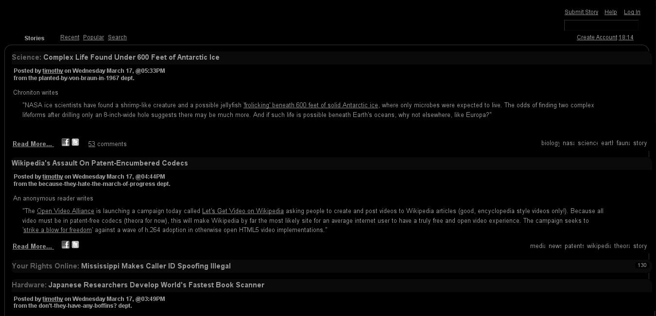
Slashdot (Original) Dark [CFH]
1
Slashdot
Slashdot: Vertical Dropdown Sidebar Menu
0
Slashdot
Slashdot button shrinker
0
Slashdot
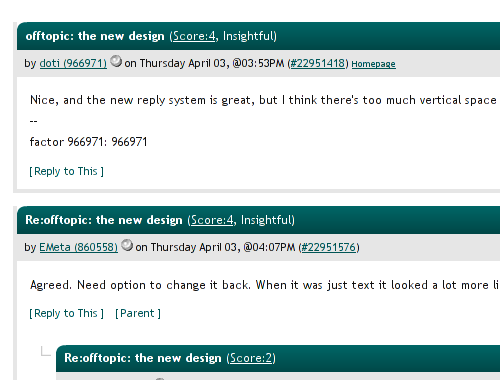
Slashdot - New Comments Tweaks
0
Slashdot
Slashdot.org - Minimalistic
0
Slashdot
slashdot.jp - smartNav
0
Enjoyin' Stylish?
Rate Us
thanks
rateStylish
What`s wrong?
Style not working
Too complicated
There`s a bug
Inappropriate content
Did not find what i was looking for
Submit Feedback


![Slashdot (Original) Dark [CFH]](https://userstyles.org/style_screenshots/108355_after.png?r=1780851706)