Create Style
What are we styling?
All
roblox
youtube
google
discord
spotify
pinterest
whatsapp
facebook
instagram
yandex
vk
tumblr
twitter
netflix
wikipedia
openai
pokemonshowdown
fandom
reddit
amazon
baidu
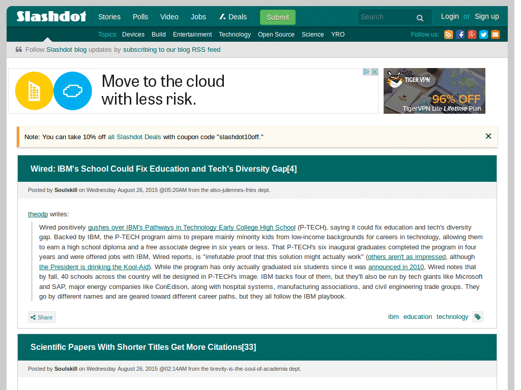
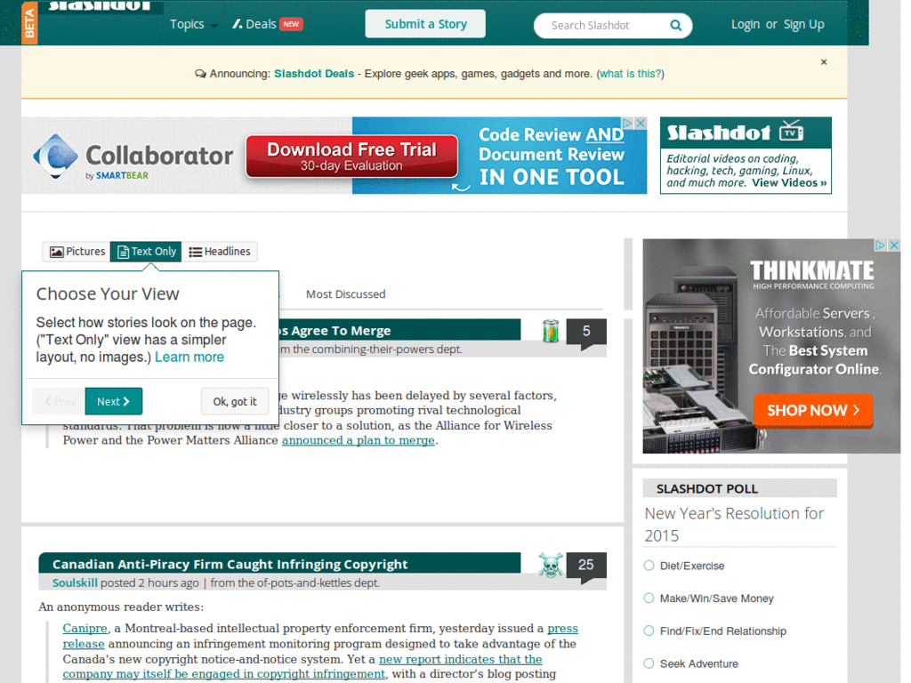
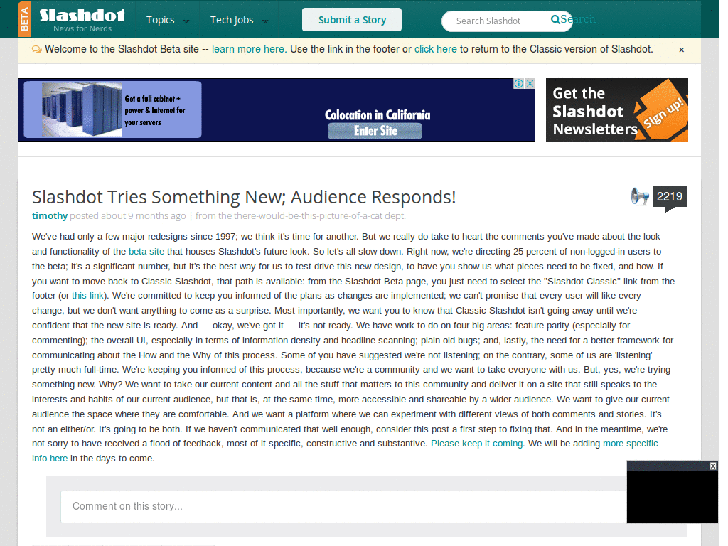
Most popular Slashdot Themes, Skins & Backgrounds
Style Slashdot with custom Slashdot themes! Change the background, color, schemes, fonts, and more! Share your own themes for Slashdot too!
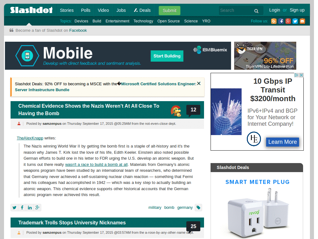
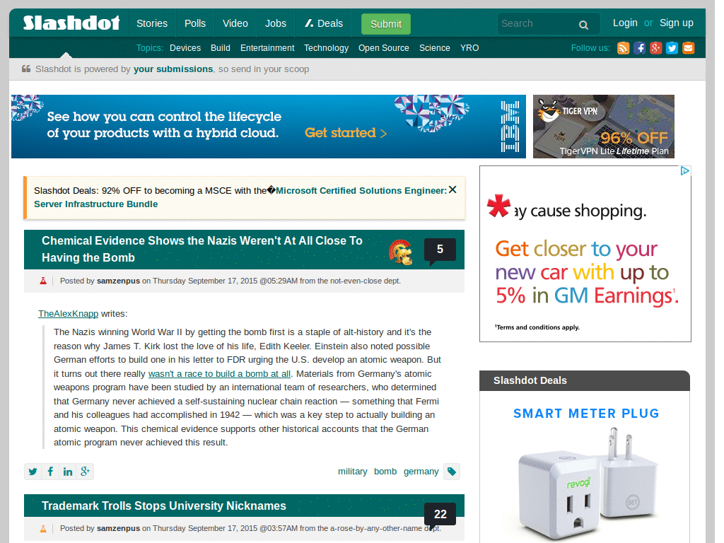
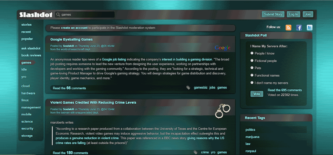
Slashdot
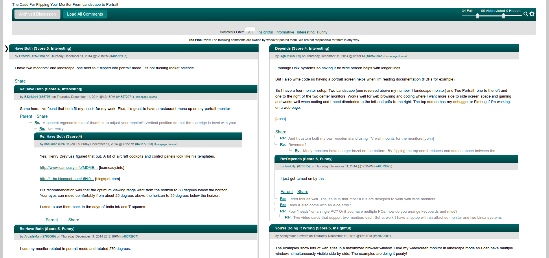
slashdot 2001 - remove whitespace
0
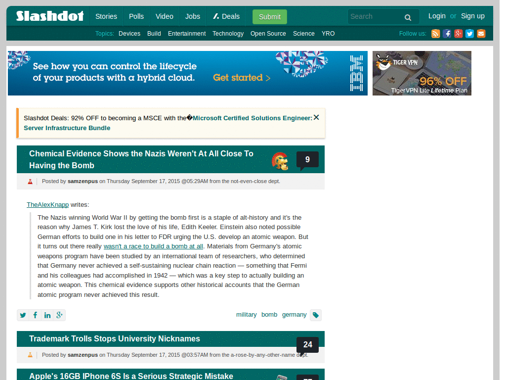
Slashdot
Slashdot Superwide
0
Slashdot
Slashdot classic mobile fix
0
Slashdot
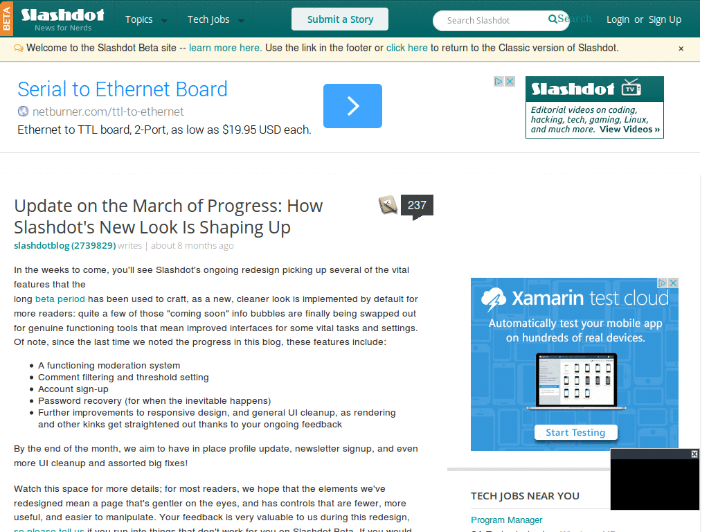
slashdot beta - classic
0
Slashdot
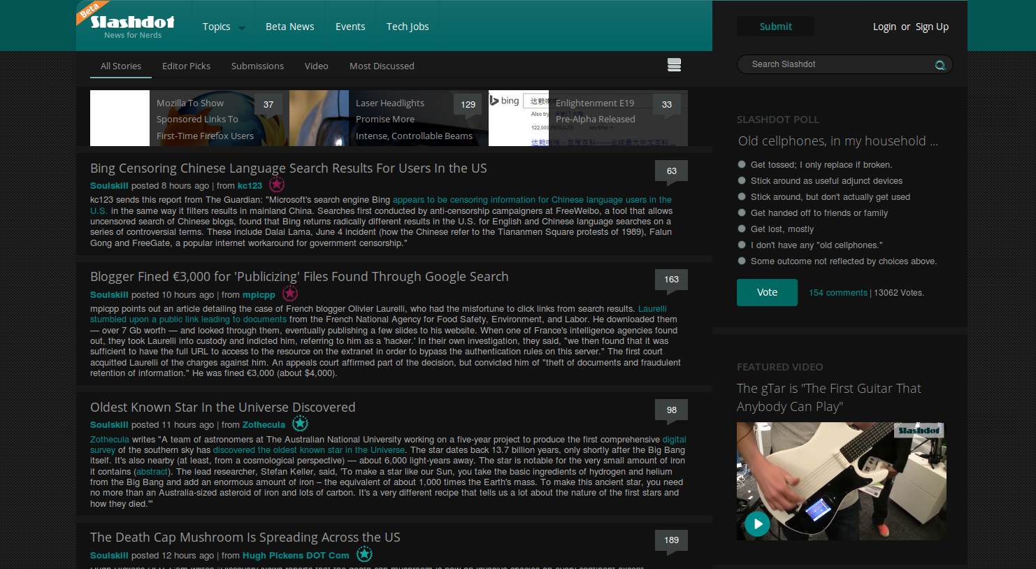
Slashdot 2014 Beta fixes - wider
0
Slashdot
Slashdot Beta Fix
0
Slashdot
Slashdot Bathys
0
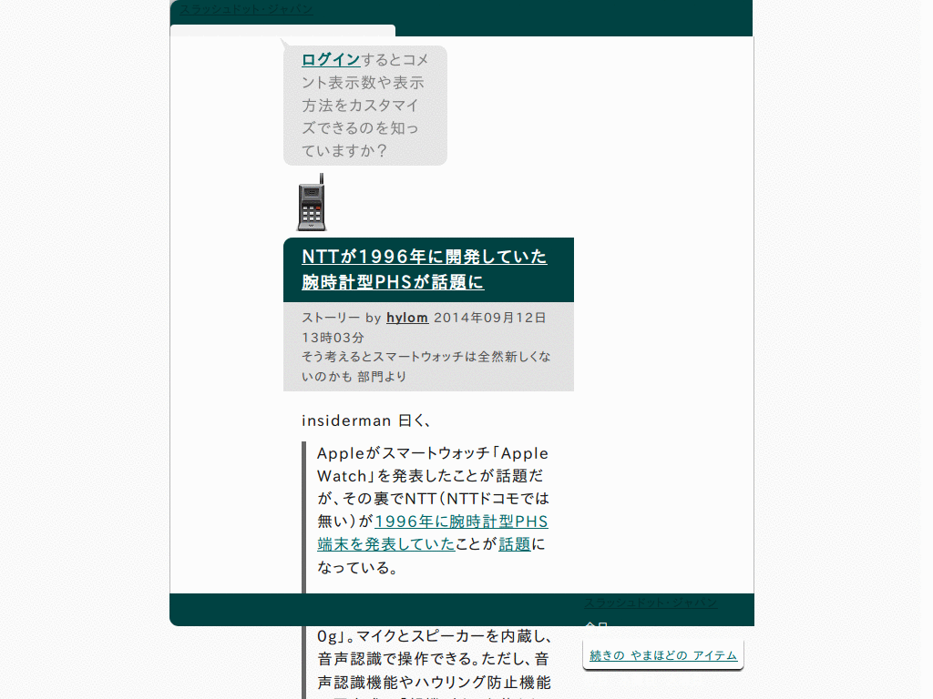
Slashdot
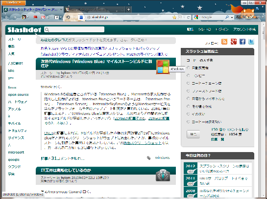
Slashdot Japan - Remove header and footer ads
0
Slashdot
slashdot dark
0
Slashdot
Slashdot - Dark Shiny Transparency - Teal
0
Slashdot
Readable for /.jp
0
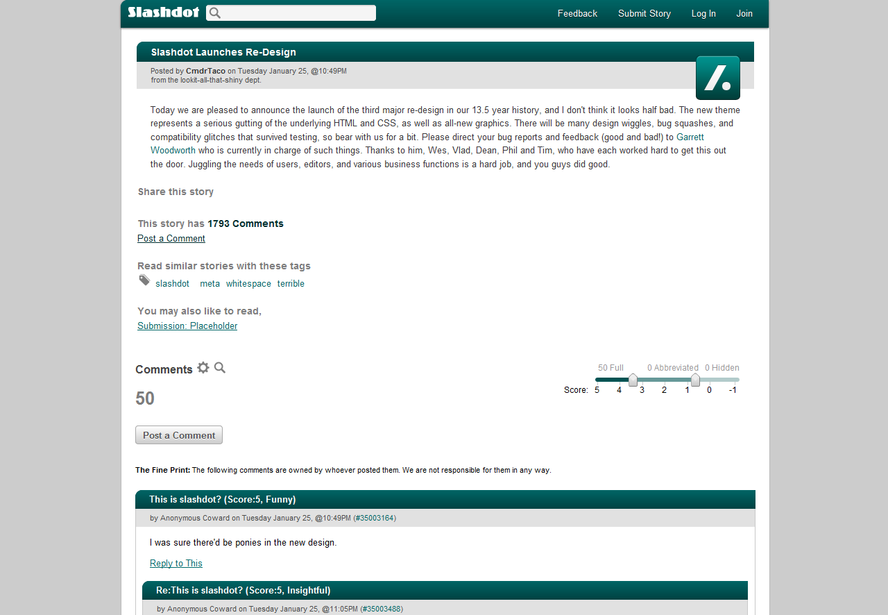
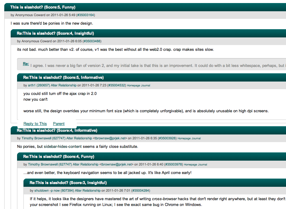
Slashdot
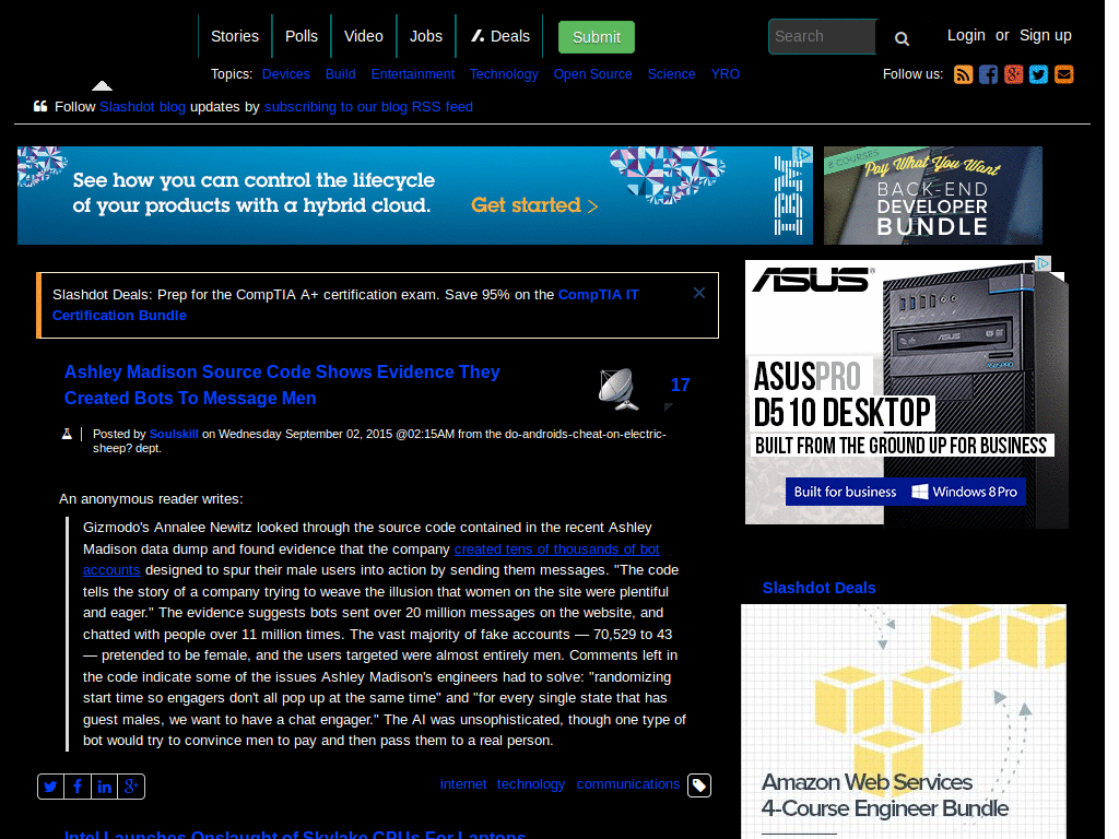
Slashdot (Original) Dark [CFH]
0
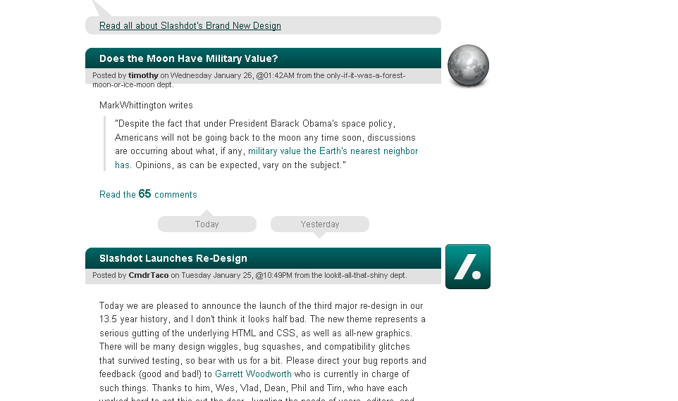
Slashdot
Slashdot 2011 Simplifier
0
Slashdot
Slashdot Cleanup
0
Slashdot
Slashdot - use whole screen width, bigger font
0
Slashdot
Slashdot - Simplified design 2011
0
Slashdot
Make Slashdot side/topbar scroll with rest of page
0
Slashdot
Slashdot comments tight
0
Slashdot
Site cleanup: 2011 update - just news nothing else
0
Slashdot
Slashdot Dark
1
Slashdot
SlashDot - Cleaner
0
Slashdot
fondo para facebook
0
Slashdot
Cleandot - Cleaner Slashdot 0.02
0
Enjoyin' Stylish?
Rate Us
thanks
rateStylish
What`s wrong?
Style not working
Too complicated
There`s a bug
Inappropriate content
Did not find what i was looking for
Submit Feedback
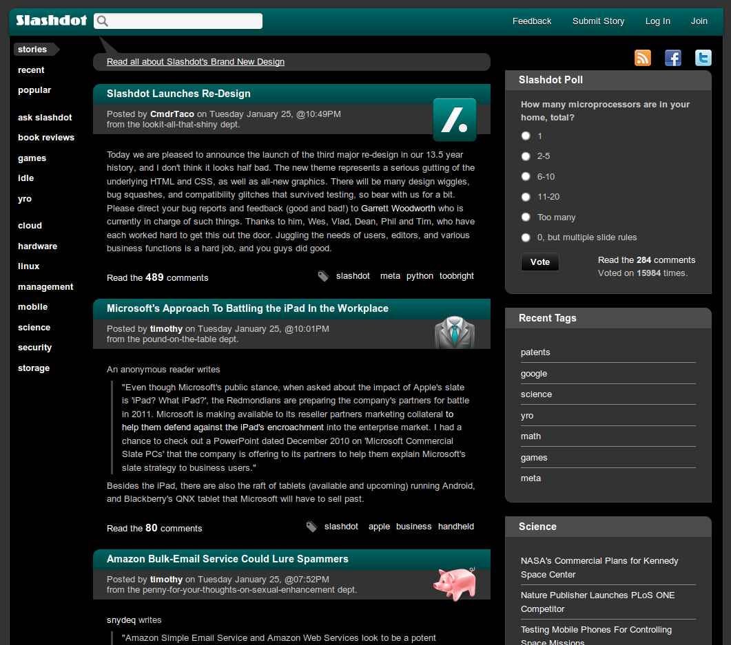
![Slashdot (Original) Dark [CFH]](https://userstyles.org/style_screenshots/108355_after.png?r=1782763225)