Create Style
What are we styling?
All
roblox
youtube
google
discord
spotify
pinterest
whatsapp
facebook
instagram
yandex
vk
twitter
netflix
pokemonshowdown
tumblr
openai
wikipedia
fandom
reddit
baidu
amazon
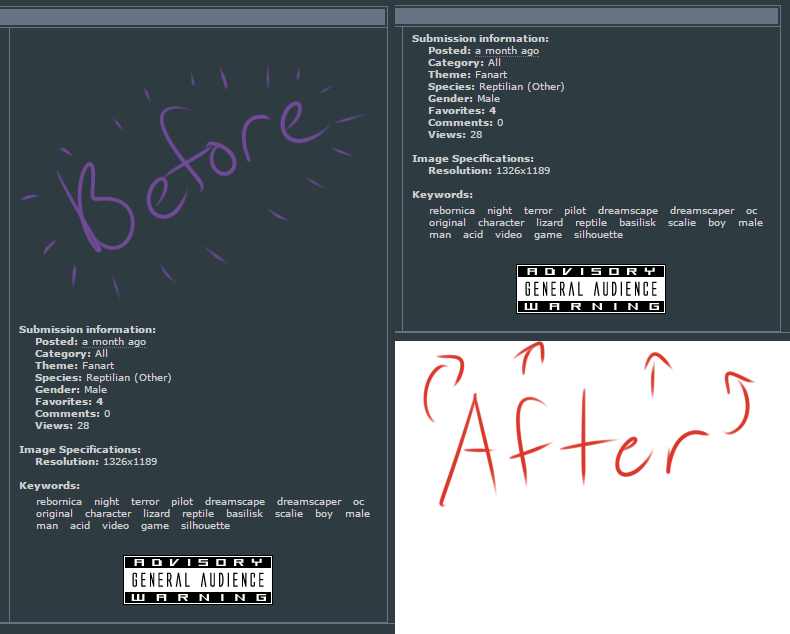
Most popular Furaffinity Themes, Skins & Backgrounds
Style Furaffinity with custom Furaffinity themes! Change the background, color, schemes, fonts, and more! Share your own themes for Furaffinity too!
Furaffinity
3.8
FurAffinity - Fall Update Large Monitor Fix
0
Furaffinity
3.7
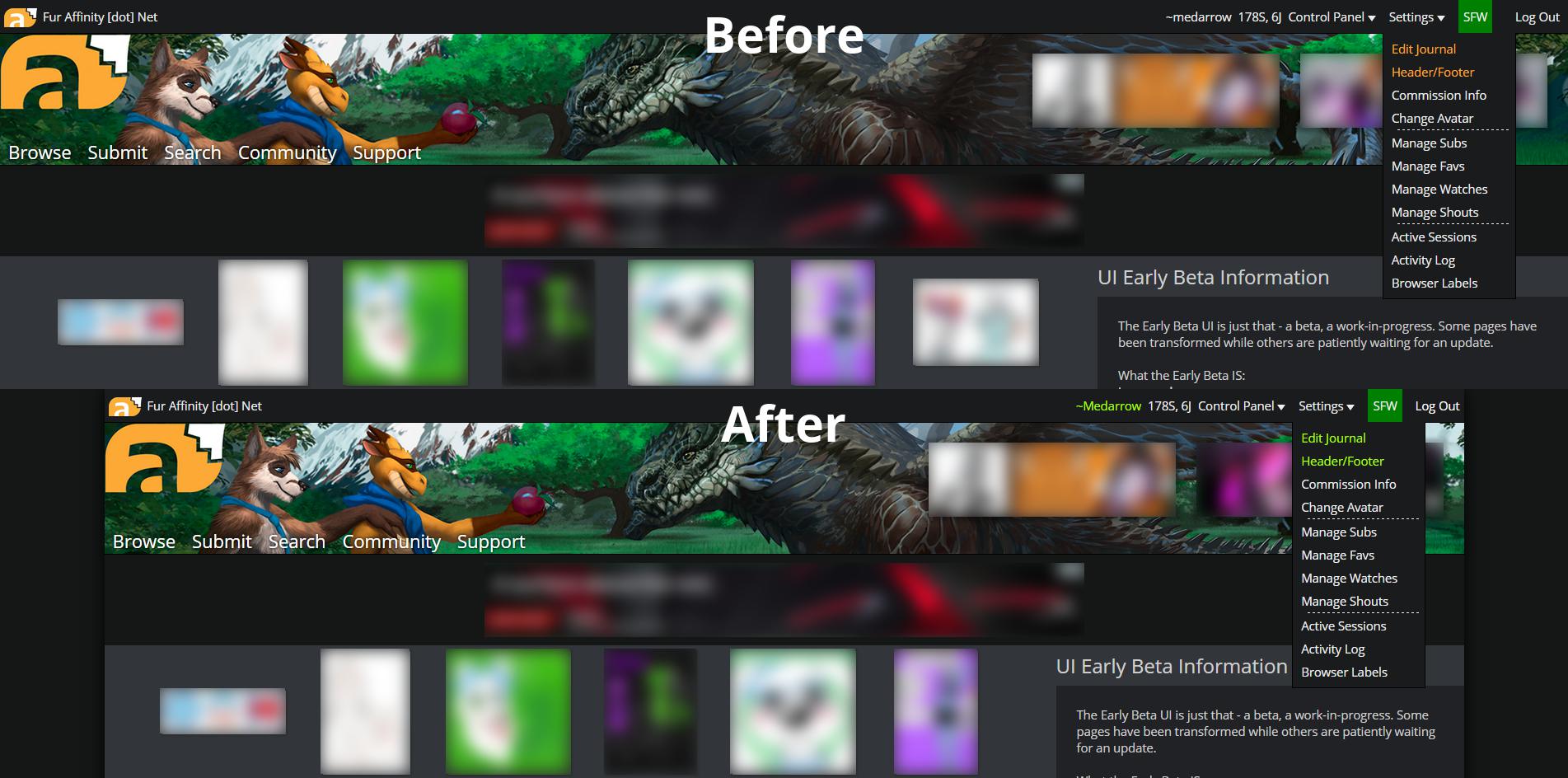
FA Beta UI - No Streams (V1)
0
Furaffinity
3.5
FA Beta Layout Improvements (Chrome) NO banner/ads
0
Furaffinity
Pride FurAffinity
0
Furaffinity
dark furaffinity forums styling
0
Furaffinity
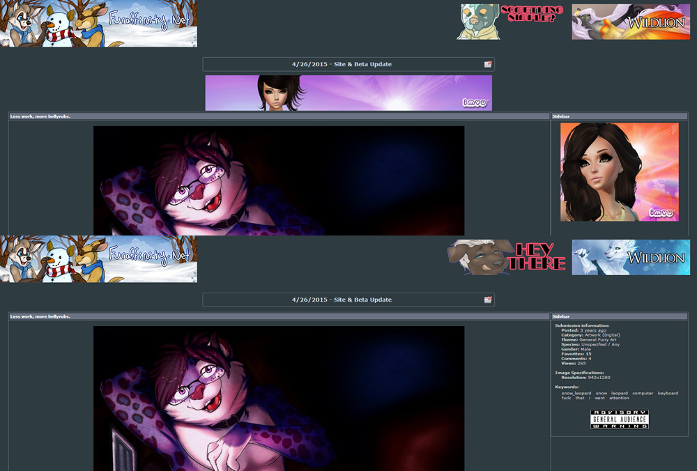
Furaffinity Sidebar Space Remover
0
Furaffinity
FA Beta UI - Sidebar Tweak (V3.1)
1
Furaffinity
Furaffinity - Submission Fit & Max Page Width
0
Furaffinity
Furaffinity Sidebar Remover
0
Furaffinity
Furaffinity Beta fix
0
Furaffinity
FurAffinity Third-Party Ad Blocker
0
Furaffinity
FA - Smaller is Beta
0
Furaffinity
OBSELETE - FA Beta [Stage1] Fixes - Light Style!
0
Furaffinity
OBSELETE - FA UI Beta [Stage1] Fixes [Alternate]
0
Furaffinity
OBSELETE - FurAffinity Beta [Stage1] Fixes
0
Furaffinity
Furaffinity Nocturnal Skin v3
0
Furaffinity
Blue and silver
0
Furaffinity
FurAffinity - Project Fursona! + (Purple)
0
Furaffinity
FurAffinity - Project Fursona! + (Red)
1
Furaffinity
FurAffinity - Project Fursona! + (Green)
0
Furaffinity
FurAffinity - Project Fursona! + (Orange)
0
Furaffinity
FurAffinity - Project Fursona! + (Blue)
0
Furaffinity
FurAffinity - Project Fursona!
0
Enjoyin' Stylish?
Rate Us
thanks
rateStylish
What`s wrong?
Style not working
Too complicated
There`s a bug
Inappropriate content
Did not find what i was looking for
Submit Feedback