Most popular Themes, Skins & Backgrounds
Style with custom themes! Change the background, color, schemes, fonts, and more! Share your own themes too!


Top Rated Themes, Skins & Backgrounds


Newest Themes, Skins & Backgrounds


Cursor Styles Themes, Skins & Backgrounds


Youtube Styles Themes, Skins & Backgrounds


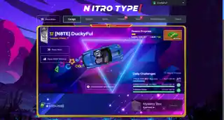
![Dark YouTube [Pink]](https://assets.userstyles.org/assets_packs/type=style/user_id=435915/screenshot_4dccb943-0844-4cd2-9d15-ab7be14e307b_thumb.webp)


Roblox Styles Themes, Skins & Backgrounds


Google Styles Themes, Skins & Backgrounds


Firefox 9 - Restore left border on reload button
Recommended Styles
Information
LICENSE
Not setAPPLIES TO
DESCRIPTION
NOTES
DATE CREATED
November 16, 2011
LAST UPDATED
December 21, 2011
SHOW CSS
Enjoyin' Stylish?
Rate Us
thanks
rateStylish
What`s wrong?
Submit Feedback
Comments