Most popular Themes, Skins & Backgrounds
Style with custom themes! Change the background, color, schemes, fonts, and more! Share your own themes too!


Top Rated Themes, Skins & Backgrounds


Newest Themes, Skins & Backgrounds


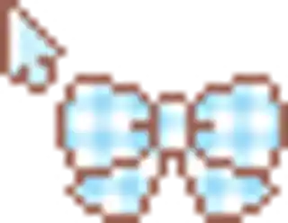
Cursor Styles Themes, Skins & Backgrounds


Youtube Styles Themes, Skins & Backgrounds


![Dark YouTube [Pink]](https://assets.userstyles.org/assets_packs/type=style/user_id=435915/screenshot_4dccb943-0844-4cd2-9d15-ab7be14e307b_thumb.webp)


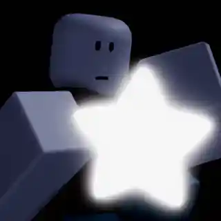
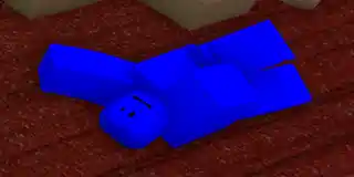
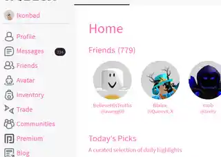
Roblox Styles Themes, Skins & Backgrounds


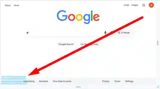
Google Styles Themes, Skins & Backgrounds


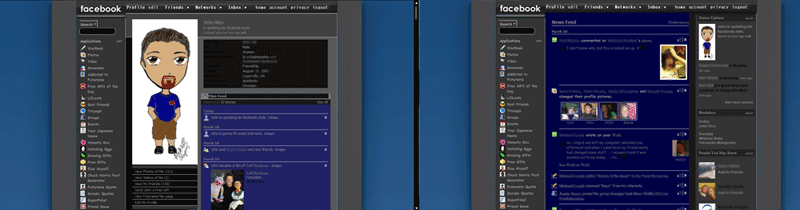
Black, blue, greyed and glossed, with NO adds
Recommended Styles
Information
LICENSE
Not setAPPLIES TO
DESCRIPTION
DATE CREATED
January 22, 2008
LAST UPDATED
September 14, 2008
SHOW CSS
Enjoyin' Stylish?
Rate Us
thanks
rateStylish
What`s wrong?
Submit Feedback
Comments