Most popular Themes, Skins & Backgrounds
Style with custom themes! Change the background, color, schemes, fonts, and more! Share your own themes too!


Top Rated Themes, Skins & Backgrounds


Newest Themes, Skins & Backgrounds


Cursor Styles Themes, Skins & Backgrounds


Youtube Styles Themes, Skins & Backgrounds


![Dark YouTube [Pink]](https://assets.userstyles.org/assets_packs/type=style/user_id=435915/screenshot_4dccb943-0844-4cd2-9d15-ab7be14e307b_thumb.webp)


Roblox Styles Themes, Skins & Backgrounds


Google Styles Themes, Skins & Backgrounds


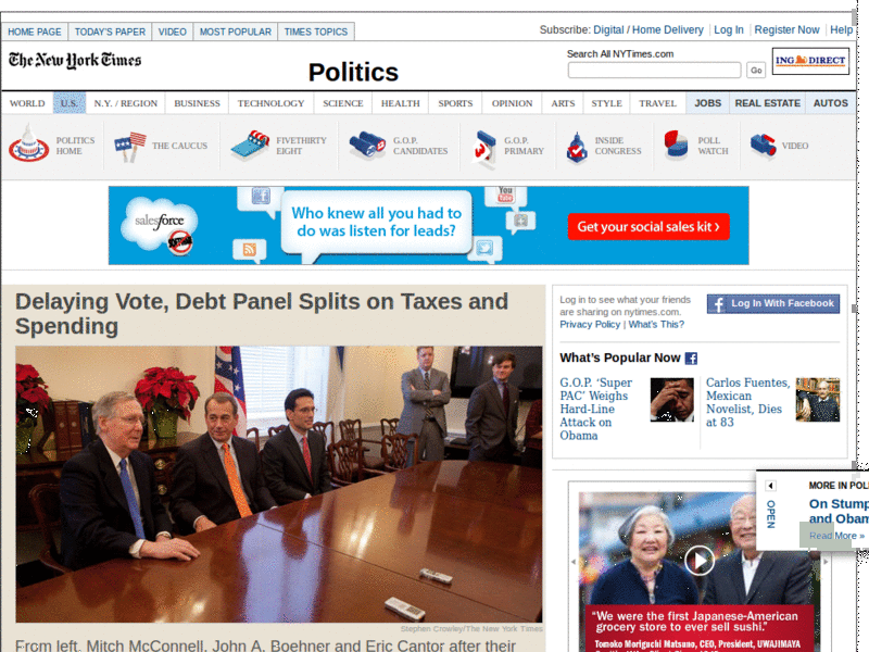
NYTimes, easier reading, low-contrast for Mac
Recommended Styles
Information
LICENSE
Not setAPPLIES TO
DESCRIPTION
NOTES
DATE CREATED
December 01, 2010
LAST UPDATED
September 09, 2011
SHOW CSS
Enjoyin' Stylish?
Rate Us
thanks
rateStylish
What`s wrong?
Submit Feedback
Comments