Most popular Themes, Skins & Backgrounds
Style with custom themes! Change the background, color, schemes, fonts, and more! Share your own themes too!


Top Rated Themes, Skins & Backgrounds


Newest Themes, Skins & Backgrounds


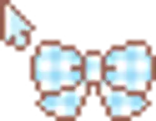
Cursor Styles Themes, Skins & Backgrounds


Youtube Styles Themes, Skins & Backgrounds


![Dark YouTube [Pink]](https://assets.userstyles.org/assets_packs/type=style/user_id=435915/screenshot_4dccb943-0844-4cd2-9d15-ab7be14e307b_thumb.webp)


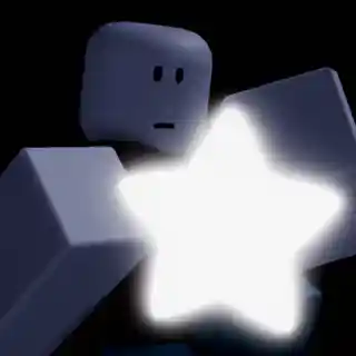
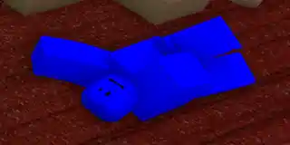
Roblox Styles Themes, Skins & Backgrounds


Google Styles Themes, Skins & Backgrounds


Enjoyin' Stylish?
Rate Us
thanks
rateStylish
What`s wrong?
Submit Feedback
Comments